Deconstructing Map Styles: A Guide to Rebranding with Major League Maps
Deconstructing Map Styles: A Guide to Rebranding with Major League Maps
Maps aren't just functional tools—they're powerful branding assets. The visual style of your map can significantly impact user experience and brand perception. To demonstrate this, Claude and I built Major League Maps: an interactive demo that applies 90+ sports team brand colors to maps in real-time.
Select a Team
Try selecting different teams from NFL, NHL, and MLB to see how brand colors transform the map instantly.
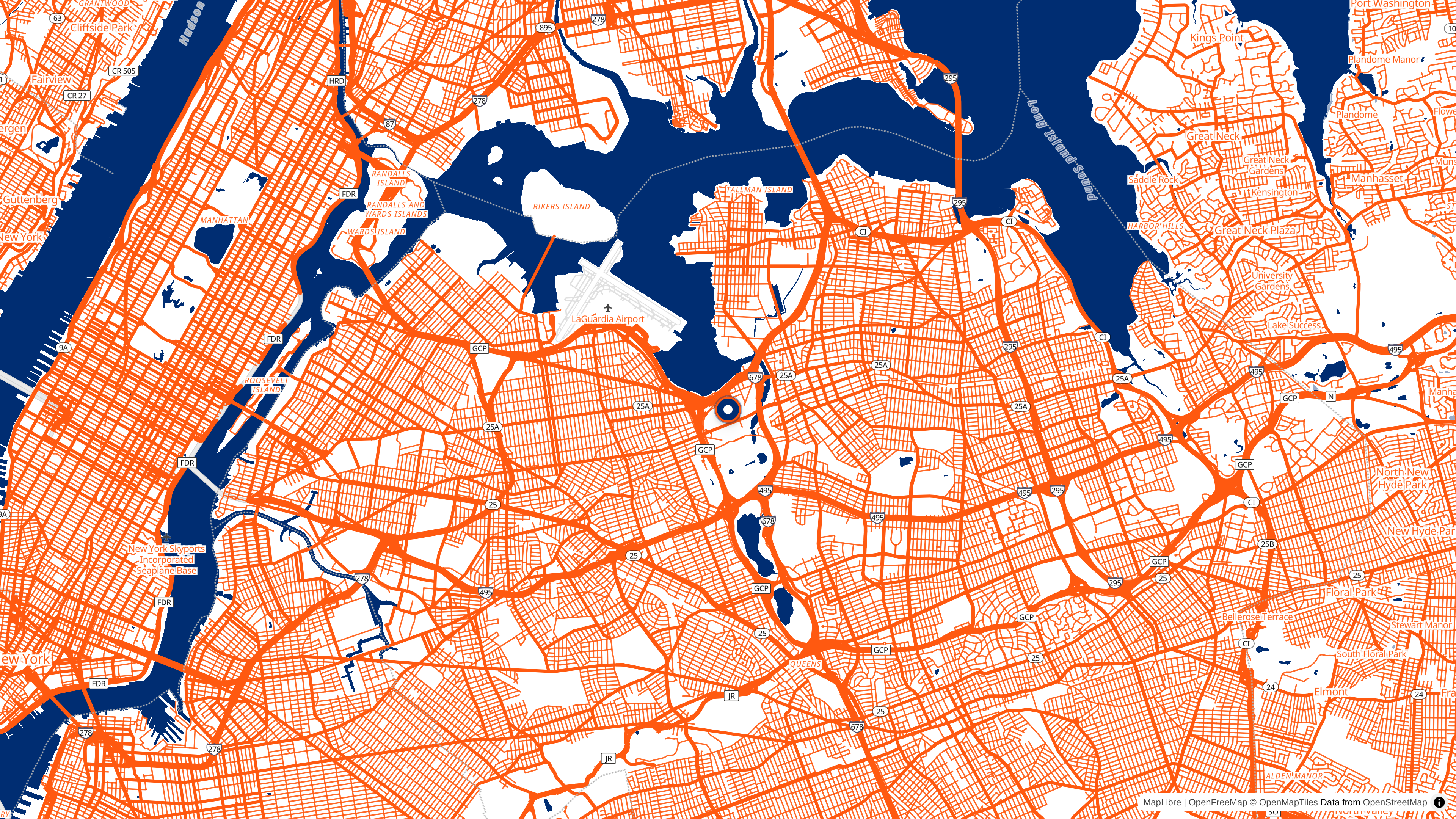 The New York Mets' distinctive blue and orange color scheme applied to the map around Citi Field.
How It Works
The demo uses MapLibre GL JS to dynamically modify paint properties at runtime:
- Primary brand color → Water bodies (most prominent feature)
- Secondary brand color → Roads and text labels
- Support colors → Background, parks, and buildings
This simple three-color strategy creates dramatic visual transformations while maintaining map readability.
Key Learnings
Challenge #1: Incomplete Layer Coverage
We focused on high-impact layers (water, roads, background, text) but didn't modify everything. Airport symbols, river names, and some administrative boundaries keep their original styling. For production, you'd need to audit all layers for complete brand consistency.
Challenge #2: Text Legibility with Light Colors
Teams with white/light color schemes (Chicago White Sox, New York Yankees) created readability issues. City labels need strong contrast—we used 4px text halos, but dynamic color selection based on luminance would work better.
Challenge #3: Color Weight Balance
UI color proportions (primary: 60%, secondary: 30%, support: 10%) don't always translate to maps. Geographic coverage matters more—water bodies dominate regardless of color hierarchy. Claude identified that the Toronto Blue Jays' red accent, despite being a "support" color, appeared more prominent than intended on certain map features.
Demo Features
- Auto-play mode: Cycles through teams with smooth zoom-out/zoom-in animations
- All stadiums view: Show all team locations for a league simultaneously
- Style controls: Toggle street names, adjust zoom behavior
- 90+ teams: NFL, NHL, and MLB coverage
A Note on This Demo
Full transparency: Team color palettes are AI-generated approximations based on official colors, not official brand guidelines. This is version 1.0—I'd love feedback on:
- Color accuracy for your favorite team
- Additional teams or leagues to include
- Map layers that need better styling
Join the #30DayMapChallenge
The #30DayMapChallenge is coming up in November! I'm planning to participate and explore more creative cartography. Whether you're a seasoned cartographer or just getting started, it's a fantastic opportunity to learn and connect with the mapping community.
The Bigger Picture
This demo proves that dynamic map styling isn't just theoretical—it's practical and achievable. The same approach works for:
- Corporate branding: Apply company colors to maps in your app
- Thematic styling: Create mood (dark mode, outdoor adventure, etc.)
- Accessibility: Adjust contrast ratios for better readability
Whether you're building a real estate app, delivery service, or travel platform, understanding how to customize map styles empowers you to create experiences that truly resonate with your brand and users.
What would you rebrand a map for? Drop me a line—I'd love to hear your ideas.